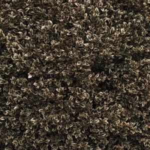
I had gotten a new lens and was on vacation. That meant that photographs would be taken! It was a really overcast day and I was wandering around in front of mom’s house when I saw a bush. I liked what I saw so I snapped a picture.
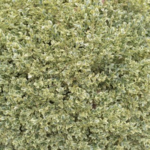
Doesn’t look like much I know but what attracted me to it was the shapes, the contrast inside each leaf, and how visually dense the picture would end up being. If I would have shot this with film, it probably would have been on 4×5 TXP shot at an EI of 200, developed in D-76 1:1 at n+2, printed on my favorite cold tone paper (zone 6 Brilliant) with a highish filter, and then toned with selenium. For those of you not familiar with darkroom talk, all that essentially means I would have shot and processed it to add some contrast. The toning means that I would take the image from a straight B&W to having the image (as opposed to the paper) turn a very slight eggplant color. Anyway, it would have looked something like this:
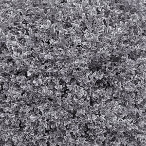
Truth be told, this is how I “saw” the bush when I brought the camera up. In my mind, this is the essence of modernist “art” photography. The process is there to bring out what the photographer sees in their mind. It is a unique window into how the artist sees the world. With practice, the photographer “sees” the world through his materials and understands what it will look like at the end. For me, this was the appeal of photography. Being able to see things a certain way and bring them into the world was very satisfying.
OK, fine, you were comfortable with the darkroom materials Isaac but it’s a brave new world. And yes, I fully admit that I’m not nearly as comfortable with modern photography processes. Photoshop is a world that I don’t plan on getting into. I find it to be complete overkill for most photo uses and better suited to graphic artists. I stumbled across Topaz Labs and they make a series of tools that I find more approachable. Mind you, I am still a bit bewildered over the sheer number of options it presents but I at least feel comfortable noodling around with it.
One of the more basic tools in digital photography processing is layers. Essentially, you are able to have different versions of the picture and you can blend them to various degrees. I had an idea of how I could combine the first two versions and get a third that I think would look good. With a little practice I might be able to anticipate this and use it in my previsualization while shooting. Here’s how it turned out:
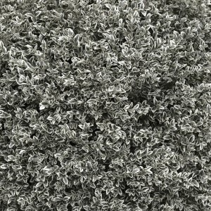
It’s a little subtle, but there is a bleached out green undertone to it. There are also some interesting contrast implications to when you combine a lower and higher contrast image like that as well.
So OK, mission accomplished, right? Well… Like I said, I’m still trying to get my head around what is possible with a digital workflow. The Topaz Labs programs (all 13 of them!) have a button that is labeled “I feel lucky.” It is a pot luck button, giving you a random batch of settings in their program. Either that or it gives you a random pick from their presets. Either way, it’s pretty random. I clicked it a few times in their B&W app and the third time I got this:
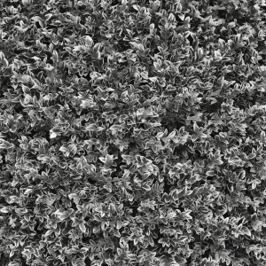
This is a pretty straight conversion to B&W but it has really reduced the detail seen in the smallest features while possibly increasing the contrast for the larger details. I think there are also some interesting things going on with the contrast of the middle tones. It is simultaneously flatter and more dynamic (IMO) which is something I didn’t think was possible. I saved these settings and may try to use these with future pictures.
OK, so that is broadening my possible tools in my tool kit. I find these things manageable and reasonable to remember. But what about color? I loaded up the original into the color program and hit the “I feel lucky” button. Whoa:
OK, this is nuts, and beautiful. It’s darker, higher in contrast and was made two tone somehow. The highlights have gone a sepia color and really stand out from the background. I think there have been things done to the various levels of contrast in the micro and medium levels of detail. I could never have guessed this beforehand, there are just too many moving parts. I saved the settings but I have no idea how I’ll be able to imagine this beforehand. Just for kicks, I hit the lucky button again.
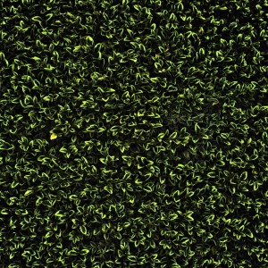
This is just getting silly now. I really like how this looks, it’s very graphic and it retains the density I was attracted to in the first place. It is also completely unrecognizable as the scene I first shot. Yes, I saved these settings as well.
So what’s the problem? Isn’t making cool and beautiful images the whole point? Isn’t it great that buttons can transform your picture so completely? Um, no and no thank you. Once again, the “point” of my serious photography wasn’t to make pretty images (though that happens sometimes) but to bring out the way I was seeing that that scene or maybe even to explore and try to make visual sense of what I was seeing. There was intention to my pictures. Any monkey can punch buttons until they get something they think is cool looking. What I find bewildering is the ability to totally transform your image in every way. Back in the darkroom days there were significant restrictions to what could be done. I’d argue that was good for photographers like myself but bad for graphic artists. Working with constraints of some sort made you channel how you see. Without the constraints, it is much more difficult to “see” what you’re working towards when you snap the shutter.
And yes, it is possible to constrain yourself in theory. I think I could even manage to do it in practice for B&W. And yes, some kinds of pictures like people pictures don’t lend themselves to crazy adjustments. I continue to find color landscape and general scene photography difficult to do with any sort of forethought and intention. I will also admit to being a little put out by a button completely changing my original picture and doing things that are simultaneously completely unlike what I was originally thinking and cool at the same time. As nice as I think those versions look, they aren’t my pictures. Yes, I pressed the shutter button but I had nothing to do with how it ended up looking. Pictures that are unintentionally may be fun to look at but they are unsatisfying to make.
Maybe I should start all over again. Shoot with B&W in mind only for a while and eventually move into color again. I dunno. I do feel as though I’m starting all over again. Maybe that’s what is really bothering me…
Please subscribe and find out as soon as I publish a new blog post and/or podcast!
Start receiving "Life as I see it podcast" Broadcast updates now:
Subscribe on App.net

