There is something evocative about classic sports jerseys. Baseball has the Yankees, the Red Sox, and the Dodgers. Classic and iconic. Basketball jerseys have never been anything special, and football uniforms have always been dominated by the helmets. The Actual football jerseys are either no big deal or silly looking… Don’t get me started on soccer jerseys, they look like race cars with all of their ads…
The one sport that doesn’t get enough credit for classic looks is hockey. My team, the capitals, have a pretty tacky jersey IMO, always have… But there are some classics. The number one, the most iconic perhaps in any sport (certainly in Canada) is the jersey (or sweater as they call it in hockey) of the Montreal Canadiens. Check it out…
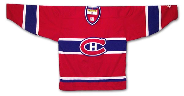
The current version dates from the 1950’s. In the hockey world, this team is the king. They have more championships than any other professional sports team in North America. To me, it is a graphic masterpiece steeped in history. Another from that era is from Chicago…
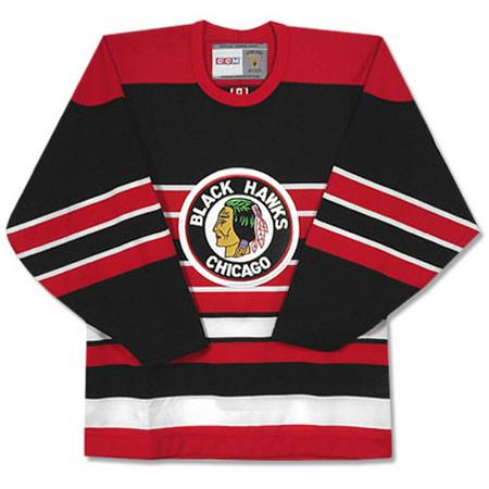
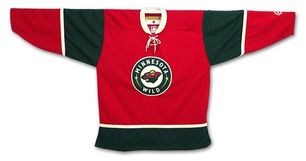
This one also dates from the 50’s and was recently worn in the “Winter Classic” today. This one has the same iconic look, but it also, as my dad noted, looks tough. There is also a newer jersey with the classic look, this one is from the Minnesota Wild.
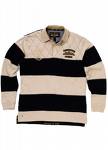
After looking at these a little more, I wonder if my impression of “toughness” comes from their similarity to some rugby jerseys I’ve seen.
In any case, I would wear any of these even though I’m not a fan of any of those teams. There is something very graphic about them and they are tied to a feel from the sport that I like. So why is my team’s jersey so bad in comparison?